
Meta Title: Interior Design Color Combinations Guide
Meta Description: Discover the best interior design color combinations for every room, with practical tips for matching walls, furniture, flooring, lighting, and décor.
Focus Keyword: interior design color combinations
Related Keywords:
- best color combinations for home interiors
- living room color combinations
- bedroom color schemes
- interior color palette ideas
- modern home color combinations
Interior Design Color Combinations: What You Need to Know

Interior design color combinations can completely change how a room looks and feels. The right combination can make a small room appear more open, create a relaxing bedroom, add warmth to a living room, or give a kitchen a clean and modern appearance.
Choosing colors is not simply about picking shades that look attractive individually. The colors need to work together with the room’s natural light, furniture, flooring, ceiling, architectural details, and overall style.
A practical approach is to choose one dominant color, one supporting color, and one or two accent shades. This creates visual balance without making the room feel overly busy.
This guide explains how color combinations work, which palettes suit different rooms, how to coordinate colors with furniture and lighting, common mistakes to avoid, and practical ways to create a cohesive color scheme throughout your home.
What Are Interior Design Color Combinations?
Interior design color combinations are planned groups of colors used together within an interior space. They can include wall colors, ceilings, furniture, curtains, rugs, flooring, artwork, accessories, and decorative elements.
A successful palette usually has a clear visual hierarchy. One color may cover most of the space, another may support it, while a smaller amount of an accent color adds contrast.
For example, a living room could combine:
- Warm white walls
- Beige furniture
- Natural wood flooring
- Olive green cushions
- Black or brass decorative accents
The result can feel coordinated without requiring every item to match exactly.
How to Choose the Right Interior Color Combination
The easiest way to choose a color palette is to consider the room before choosing individual paint colors.
1. Start With the Room’s Natural Light
Lighting can significantly affect how a color appears.
A room with large windows and plenty of daylight can accommodate deeper or stronger colors. A darker room may benefit from lighter shades that reflect more available light.
Consider:
- Direction of windows
- Amount of natural daylight
- Size of windows
- Artificial lighting
- Time of day when the room is mostly used
Always test paint samples in the actual room because a color can look different on a screen, in a store, and on your wall.
2. Consider the Room Size
Light colors can help a compact room feel more spacious and open. Darker colors can create depth and a more intimate atmosphere.
However, small rooms do not automatically need to be completely white. Soft beige, warm gray, muted green, dusty blue, and other gentle shades can also work well.
For a large room, deeper colors can help make the space feel more grounded and visually comfortable.
3. Identify Existing Fixed Elements
Before selecting paint, look at the elements that are expensive or difficult to replace.
These may include:
- Flooring
- Kitchen cabinets
- Countertops
- Tiles
- Doors
- Built-in furniture
- Stone surfaces
- Large furniture pieces
Your wall color should work with these permanent elements rather than fighting against them.
4. Choose a Color Hierarchy
A useful method is the 60-30-10 approach. It is a design guideline rather than a strict rule.
You can use approximately:
- 60%: dominant color
- 30%: secondary color
- 10%: accent color
For example, a bedroom might use soft beige on most walls, medium brown through furniture and textiles, and muted green in cushions, artwork, or plants.
The percentages do not need to be exact. The main purpose is to create a sense of proportion.
Popular Interior Design Color Combinations
There is no single perfect palette for every home. The best choice depends on the architecture, lighting, furniture, and atmosphere you want.
Warm White, Beige, and Natural Wood
This combination creates a soft and timeless appearance.
It works particularly well in:
- Living rooms
- Bedrooms
- Dining rooms
- Entryways
- Open-plan interiors
Use warm white as the main background, beige for furniture or textiles, and natural wood for warmth.
White, Gray, and Black
White, gray, and black create a simple contemporary palette.
For example:
- White walls
- Medium-gray sofa
- Black lighting fixtures
- Light wood flooring
- Minimal decorative accessories
The important thing is to avoid using too much black in a small or poorly lit room.
Beige, Olive Green, and Cream
This combination brings a natural feeling into an interior.
Olive green works particularly well as an accent through:
- Curtains
- Cushions
- Artwork
- Accent chairs
- Plants
- Decorative objects
Cream and beige provide a softer background that prevents the green from dominating the space.
Navy Blue, White, and Warm Wood

Navy can add depth and character while white keeps the room visually fresh.
Warm wood helps soften the contrast.
This palette can work particularly well in:
- Studies
- Bedrooms
- Living rooms
- Dining areas
Use navy strategically instead of covering every surface with a dark shade.
Terracotta, Cream, and Brown
Terracotta brings warmth and an earthy character to a room.
Pairing it with cream and brown can create a comfortable palette for homes with natural materials.
Terracotta can be introduced through:
- Accent walls
- Ceramic décor
- Cushions
- Rugs
- Artwork
Best Color Combinations for the Living Room
The living room often contains several visual elements, so its color palette should accommodate furniture, flooring, curtains, rugs, and artwork.
Neutral Living Room
A neutral palette could include:
- Warm white
- Beige
- Taupe
- Natural wood
- Soft brown
This approach provides flexibility because colorful accessories can be changed without repainting the entire room.
Green and Neutral Combination
Soft green paired with cream, beige, or warm white can create a natural atmosphere.
Use green as an accent color if you want flexibility. A green sofa, curtains, cushions, or artwork can provide color without requiring a strong wall treatment.
Blue and Beige Combination
Blue and beige offer a balanced combination for living spaces.
A practical arrangement could be:
- Beige walls
- Blue sofa
- Cream curtains
- Natural wood furniture
- Brass or black accents
The result depends heavily on the specific undertones of the colors.
Bedroom Color Combinations
Bedrooms usually benefit from colors that create a comfortable and visually calm environment.
Soft Beige and Cream
This is a versatile choice for a warm bedroom.
Combine:
- Cream walls
- Beige bedding
- Light wood furniture
- Off-white curtains
- Subtle brown accessories
Different textures can prevent a neutral bedroom from looking flat.
Dusty Blue and White
Muted blue can provide color without becoming visually overwhelming.
Try:
- Soft blue walls
- White bedding
- Light wood furniture
- Gray-blue textiles
Sage Green and Warm White
Sage green can work well as a muted bedroom color.
Pair it with warm white rather than an extremely cool white if you want a softer appearance.
Kitchen Color Combinations
Kitchen colors should work with cabinets, countertops, backsplash, flooring, appliances, and lighting.
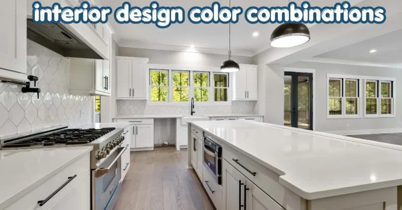
White, Wood, and Black
White cabinets combined with natural wood and small black accents create a clean contemporary palette.
Black works best as a controlled accent through:
- Cabinet handles
- Faucets
- Lighting
- Bar stools
- Appliances
Cream and Wood
Cream cabinetry with natural wood can create a warmer alternative to an all-white kitchen.
This combination works particularly well where you want a softer and more traditional appearance.
Green and Cream
Muted green cabinets paired with cream walls or countertops can add personality while maintaining a relatively calm palette.
Bathroom Color Combinations
Bathrooms often benefit from colors that complement tile and fixtures.
Popular combinations include:
- White and light gray
- Cream and beige
- White and natural wood tones
- Soft green and cream
- Blue and white
- Charcoal and warm white
For smaller bathrooms, lighter wall and tile colors can help maintain a bright visual appearance.
Interior Color Combinations by Design Style
Different interior styles tend to use color differently.
Modern Interior
Modern spaces often work with:
- White
- Gray
- Beige
- Black
- Muted earthy colors
The emphasis is usually on clean contrast and controlled accents.
Scandinavian-Inspired Interior
Common colors include:
- Soft white
- Pale gray
- Light beige
- Natural wood
- Muted blue or green
The palette generally keeps the space bright and understated.
Bohemian Interior
Bohemian interiors can accommodate more varied combinations, such as:
- Terracotta
- Mustard
- Olive
- Cream
- Brown
- Deep blue
The key is to connect different colors through repeated textiles, artwork, and accessories.
Traditional Interior
Traditional rooms often use richer and warmer combinations, including:
- Cream and brown
- Navy and beige
- Deep green and cream
- Burgundy and neutral tones
- Warm wood with soft wall colors
How to Match Wall Colors With Furniture
One common mistake is choosing wall paint without considering furniture.
Instead, start by identifying the dominant tones in your largest furniture pieces.
If your sofa is beige, you can use:
- Warm white
- Taupe
- Soft green
- Dusty blue
- Muted brown
If your furniture is dark brown, lighter walls can provide contrast and prevent the room from feeling too heavy.
If your furniture is colorful, neutral walls can help create balance.
How to Use the Color Wheel in Interior Design
The color wheel can help explain why some combinations feel harmonious and others feel highly contrasting.
Complementary Colors
Complementary colors sit opposite one another on the color wheel.
They create strong contrast and can be effective when one color is used mainly as an accent.
Analogous Colors
Analogous colors sit close together on the color wheel.
For example, blue, blue-green, and green can create a more connected palette.
Monochromatic Colors
A monochromatic scheme uses different shades, tints, or tones of one basic color.
For example, a blue room could combine:
- Pale blue walls
- Medium blue furniture
- Deep blue accessories
This creates consistency while allowing variation.
How Many Colors Should a Room Have?
There is no universal maximum number of colors. However, a room often feels more coordinated when a limited palette is repeated across different elements.
Instead of introducing many unrelated colors, select a few connected shades and vary them through:
- Texture
- Pattern
- Material
- Shade
- Saturation
For example, a neutral room can contain several beige and brown tones without looking repetitive because wood, linen, wool, metal, and ceramic surfaces reflect light differently.
Common Mistakes With Interior Color Combinations
Choosing Colors Only From Online Images
Screens display colors differently depending on settings and lighting.
Better approach: Test physical samples in your room.
Ignoring Undertones
Two beige colors may look very different because one has a yellow, pink, gray, or green undertone.
Always compare colors against your existing flooring, furniture, and finishes.
Using Too Many Accent Colors
Several unrelated accent colors can make a room feel visually scattered.
Choose a small number of accent shades and repeat them intentionally.
Making Every Room Identical
A home does not need to use the same color in every room.
Instead, create a visual connection through repeated neutrals, wood tones, metals, or complementary accent colors.
Forgetting Artificial Lighting
Warm and cool bulbs can change how colors appear at night.
Check samples under both natural daylight and the artificial lighting you actually use.
A Simple Step-by-Step Color Planning Method
If you are starting from scratch, follow these steps.
Step 1: Study the room.
Look at natural light, room size, flooring, windows, doors, and permanent fixtures.
Step 2: Choose the mood.
Decide whether you want the space to feel calm, warm, energetic, sophisticated, natural, or dramatic.
Step 3: Select a dominant color.
This will usually cover the largest visual area.
Step 4: Add a supporting color.
Use it through furniture, curtains, rugs, cabinetry, or other large elements.
Step 5: Choose an accent.
Introduce a smaller amount of stronger color through accessories and decorative details.
Step 6: Test samples.
View the colors at different times of day before making a final decision.
Step 7: Repeat selected colors.
Use the accent or supporting color in at least a few places so the room feels intentionally designed.
Tips for Creating a Cohesive Whole-Home Color Palette
A whole-home palette does not mean every room needs identical walls.
Instead, create relationships between rooms.
For example, you could use:
- Warm white as a common background
- Natural wood throughout the home
- Beige as a recurring neutral
- Olive green in selected rooms
- Black or brass as a consistent accent
This creates continuity while allowing each room to have its own personality.
Open-plan homes benefit particularly from connected color choices because several areas can be visible simultaneously.
Benefits and Limitations of Different Color Approaches
Neutral Color Palettes
Benefits:
- Flexible with furniture
- Easy to update
- Usually works with many materials
- Can create a calm background
Limitations:
- Can feel flat without texture
- Similar neutrals may appear too uniform
- Undertones can be difficult to identify
Bold Color Palettes
Benefits:
- Creates personality
- Can highlight architectural features
- Makes strong design statements
Limitations:
- More difficult to coordinate
- May become visually overwhelming
- Can limit future furniture choices
Monochromatic Palettes
Benefits:
- Naturally coordinated
- Easy to control visually
- Can create a sophisticated appearance
Limitations:
- May feel repetitive without texture
- Requires variation in tone and material
Frequently Asked Questions
What are the best interior design color combinations?
The best combination depends on the room, lighting, furniture, and desired atmosphere. Flexible options include warm white with beige and wood, navy with white and wood, sage green with cream, and gray with white and black. Rather than choosing a universal “best” palette, test several combinations against the actual materials in your room.
How do I choose colors for my whole house?
Start with a flexible base color and add two or three supporting shades that can move between rooms. Repeat materials such as natural wood or selected accent colors to create continuity. Individual rooms can still have different colors, but connecting elements help the entire home feel intentional rather than disconnected.
Which colors make a small room look bigger?
Light and moderately soft colors can help a small room maintain a brighter, more open appearance. Warm white, cream, pale beige, soft gray, and muted pastel shades are common choices. Lighting also matters, so consider both daylight and artificial lighting before deciding on a final wall color.
Should walls match furniture?
Walls do not need to match furniture exactly. In many interiors, contrast creates more visual interest. The important factor is coordination. Compare the undertones, saturation, and overall warmth or coolness of the furniture and wall color. Neutral walls can provide balance when furniture already contains strong colors or patterns.
How can I test an interior color combination before painting?
Use physical paint samples or sample boards and place them in the actual room. Observe them during morning, afternoon, evening, and under artificial lighting. Compare the samples with flooring, furniture, curtains, and countertops. This process can reveal undertones and lighting effects that are difficult to identify from a digital color chart.
Conclusion
Interior design color combinations work best when they are planned around the room rather than selected in isolation. Consider natural light, room size, existing materials, furniture, and the atmosphere you want before choosing your palette.
A simple combination of a dominant color, supporting shade, and accent can create balance without making the room feel complicated. Neutral palettes offer flexibility, while stronger colors can add personality and visual depth.
For your next project, choose three connected colors, test physical samples in the actual room, and observe them under different lighting conditions before committing to the final palette.
SEO-Friendly URL Slug
/interior-design-color-combinations/
Image Alt Text Suggestions
- Modern living room with balanced interior design color combinations
- Neutral beige and wood interior color palette for a living room
- Sage green and cream bedroom interior color combination
- Modern kitchen with white wood and black color accents
- Interior color palette ideas for a stylish modern home
Five Related Article Ideas
- Best Living Room Color Combinations for Modern Homes
- Bedroom Color Schemes That Create a Calm Atmosphere
- How to Choose Wall Colors for Your Home
- Modern Home Interior Design Ideas for Every Room
- How to Match Furniture With Wall and Floor Colors
Rank Math Schema Title
Interior Design Color Combinations Guide
Rank Math Schema Description
Explore practical interior design color combinations for living rooms, bedrooms, kitchens, and bathrooms, with expert tips for choosing balanced home color palettes.
Focus Keyword
interior design color combinations
Five Related Keywords
- best color combinations for home interiors
- living room color combinations
- bedroom color schemes
- interior color palette ideas
- modern home color combinations